“They train us to do our charting after every single patient, but with how many patients we have, it’s just not realistic,” remarked Deisha K., a certified nurse’s assistant (CNA), during our user interview. “Oftentimes, I have to stay past my shift just to finish it all.”
Other interviewees echoed the same sentiments, speaking of clunky software that got in the way of patient care, instead of helping medical professionals do their job to the best of their ability. Electronic medical record (EMR) software was a hurdle for them instead of being an indispensable tool for the modern-day physician.
Surrounded with medical professionals all my life, I have seen firsthand the frustrations of nurses and practitioners with completing patient charts. This frustration was the catalyst for me and my project partner Caroline Padilla to investigate and improve usability in EHR systems for our senior project in Cal Poly Liberal Arts and Engineering Studies (LAES).
Read the Full Paper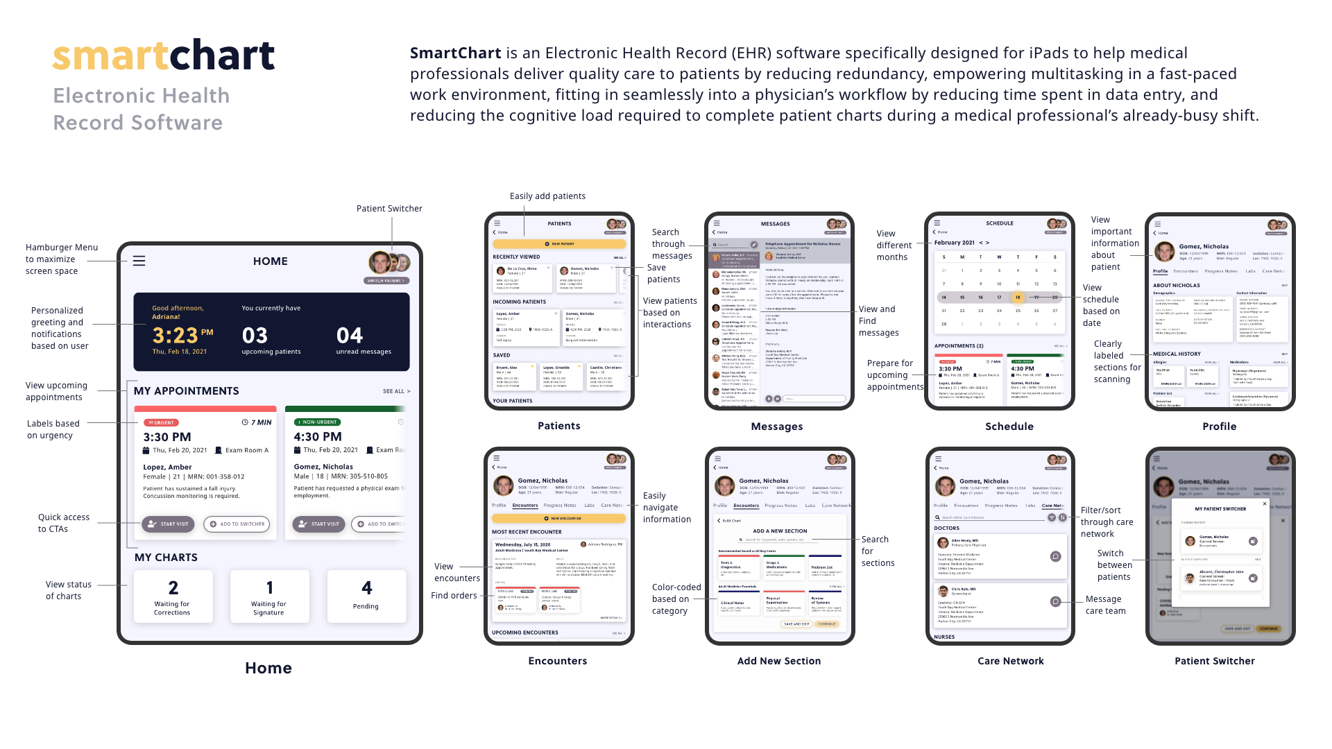
To begin the research process, I conducted a survey of current literature and existing research in the field of usability with regards to EMRs. According to the U.S. Centers for Medicare & Medicaid Services (2020), health spending in the United States accounts for 17.7% of the nation’s gross domestic product, with healthcare being a $3.2 trillion-dollar industry as of 2019. The implementation of EMR software allows for lower costs in the business of healthcare, with the additional benefit of increased quality of care and improved communication with patients (Smelcer et al., 2009). These benefits led to the industry rushing to digitize its workflow in medical practices everywhere. However, due to steep learning curves, unintuitive interfaces, and the requirement for copious training hours, Smelcer et al. (2009) found that up to 30% of EMR software implementations in the country have been doomed to failure.
In two case studies done on Cedars Sinai Medical Center and Kaiser Permanente, Smelcer et al. (2009) found that clinicians struggled to complete simple tasks on the EMR software, often taking much longer (upwards of an additional 30 to 75 minutes a day) to complete data entry on the computer than on paper. It is this specific gap in efficiency and usability that our team hopes to bridge with SmartChart.
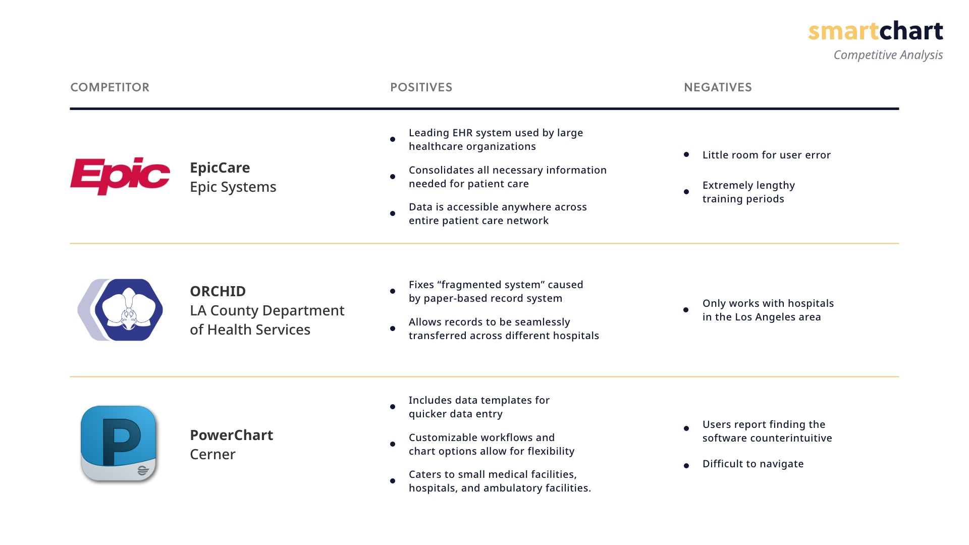
We then proceeded to look into other EMR systems currently in the market and researched what such solutions succeeded and failed in doing for their users. The three we examined were EpicCare, ORCHID, and Cerner PowerChart. Systems like Epic have become the industry standard for large healthcare facilities around the nation, but users find it to be inflexible and unforgiving. ORCHID is an in-house solution used by the Los Angeles County Department of Health Services. Although it is a great improvement from the paper-based record system that it replaced, it is only designed to accomodate the LA County public healthcare system and does not serve as a universal system for all to use. Lastly, PowerChart is lauded for its flexibility with templates and customizable workflows, but users find it to be counterintuitive and difficult to navigate.
Keeping these pain points in mind, I developed the following problem statement:
"With up to 30% of EMR software implementations failing in the United States due to steep learning curves, disruption of established workflows, and clunky, unattractive interfaces, medical professionals find themselves living with difficult-to-use software that does not cater to their needs, often at the cost of the quality of care for patients."
We then use this problem statement to invert into a vision statement:
"SmartChart will help medical professionals deliver quality care to patients by reducing redundancy, empowering multitasking in a fast-paced work environment, and fitting in seamlessly into a physician’s workflow by reducing time spent in data entry, eliminating the need for hours or even days of software training, and reducing the cognitive load required to complete patient charts during a medical professional’s already-busy shift. "
In order to gain insight into our users and their environment, we conducted 4 user interviews. We chose four subjects who varied in experience, age, and profession to get a general idea of our typical user since EHR systems are used throughout a patient’s entire care network.
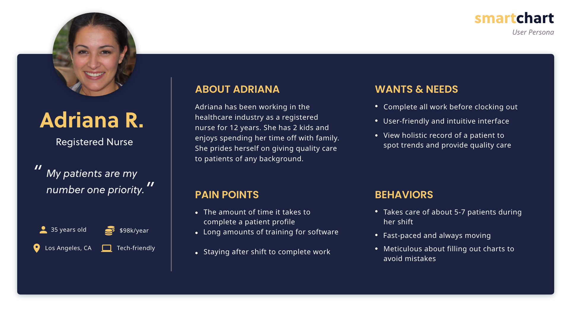
Our goal with the user interviews was to discover how nurses feel about logging medical data, and what processes they use to complete the task. From the interviews, we found that nurses preferred using EHR systems compared to the previous paper system, as information is more easily accessible. One of our subjects noted that switching to computers has relieved the symptoms of carpal tunnel that she previously developed from writing charts all day.
The biggest pain point we discovered is the length of time it takes to complete a chart for each patient, and many felt like time on the computer took away from time with the patient. In addition, nurses work in a fast-paced environment and are frequently interrupted during charting, which makes the process even longer. We also found that existing EHR systems tend to have overcomplicated interfaces, which make the system difficult to learn. Nurses usually tend to depend on their muscle memory to save time when charting, especially since there are little to no shortcuts for commonly used features. Nurses have noted that templates and auto-fill help speed up the process of charting.
After conducting our user interviews to gain insight into our users, we compiled and analyzed the data to find trends for our typical user using a user persona. A user persona is a fictional character created to aid in the visualization of user goals and needs for a product, which include descriptions about the character’s attributes and background information. By creating a user persona, we are able to empathize with our end user and further define the scope of our project by elaborating on what features are necessary for the user. In addition, the user persona consolidates the information gained from user interviews into something more communicable to our stakeholders and our team.
In order to facilitate "divergent thinking" to help our team develop solutions for our problem space, we developed "How Might We..." (HMW) questions to further outline our goals and find solutions to meet those goals. This was a great opportunity for us to frame user pain points as opportunities for growth and improvement.
Some of these questions include:
With these in mind, we used the Crazy 8 technique for quick sketching for potential answers to these questions.
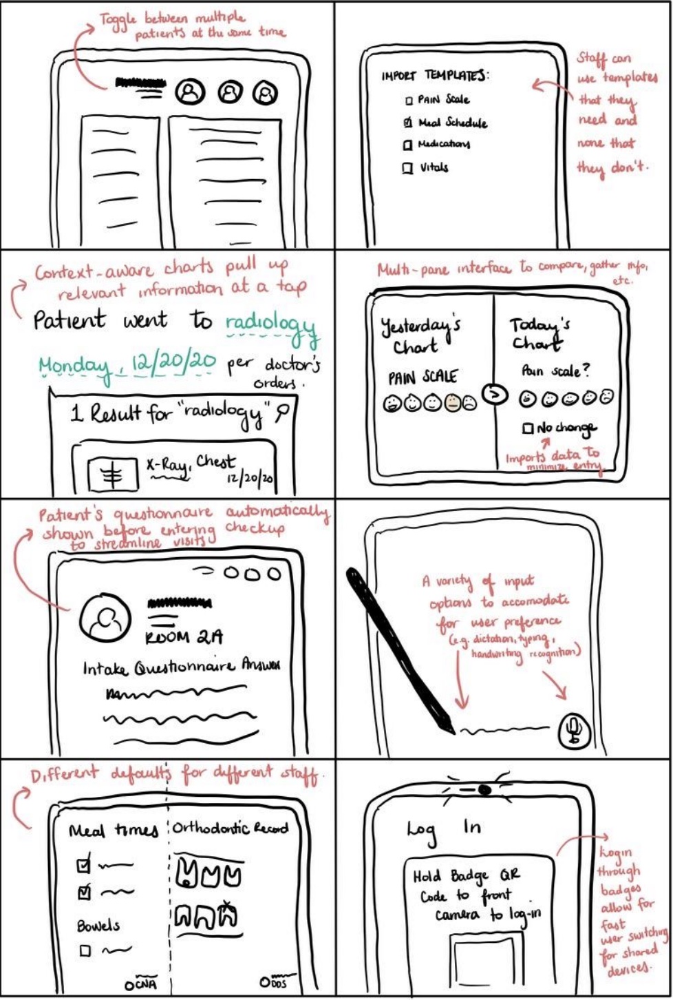
The Crazy 8 technique entails splitting a piece of paper (in this case, a digital canvas) into 8 panes and spending a minute on each to think of low fidelity solutions to the questions posed. To answer our HMW questions, I envisioned SmartChart to be a more flexible system, allowing for fast user switching and the ability to care for multiple patients at the same time. Time-saving essentials such as templates and multi-pane views reduce the need to switch back and forth between different charts, allowing for comparison, auto-population, etc. in cases where there is no change in the patient's condition.
We also sought out solutions that bring the "Smart" to SmartChart, such as context-aware tooltips that integrate relevant test results, visit notes, and other medical information in the patient's chart to build a complete picture of the patient's ongoing care. We also envisioned a system that is adaptable based on the medical provider's current and upcoming schedule, line of specialty, preferred methods of notetaking, etc. to create a documentation solution that is tailor-fit for the needs of the users.
We then used these Crazy 8 sketches to develop our early wireframes on inVision.
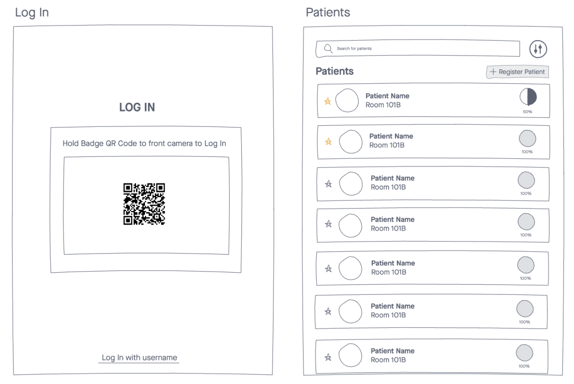
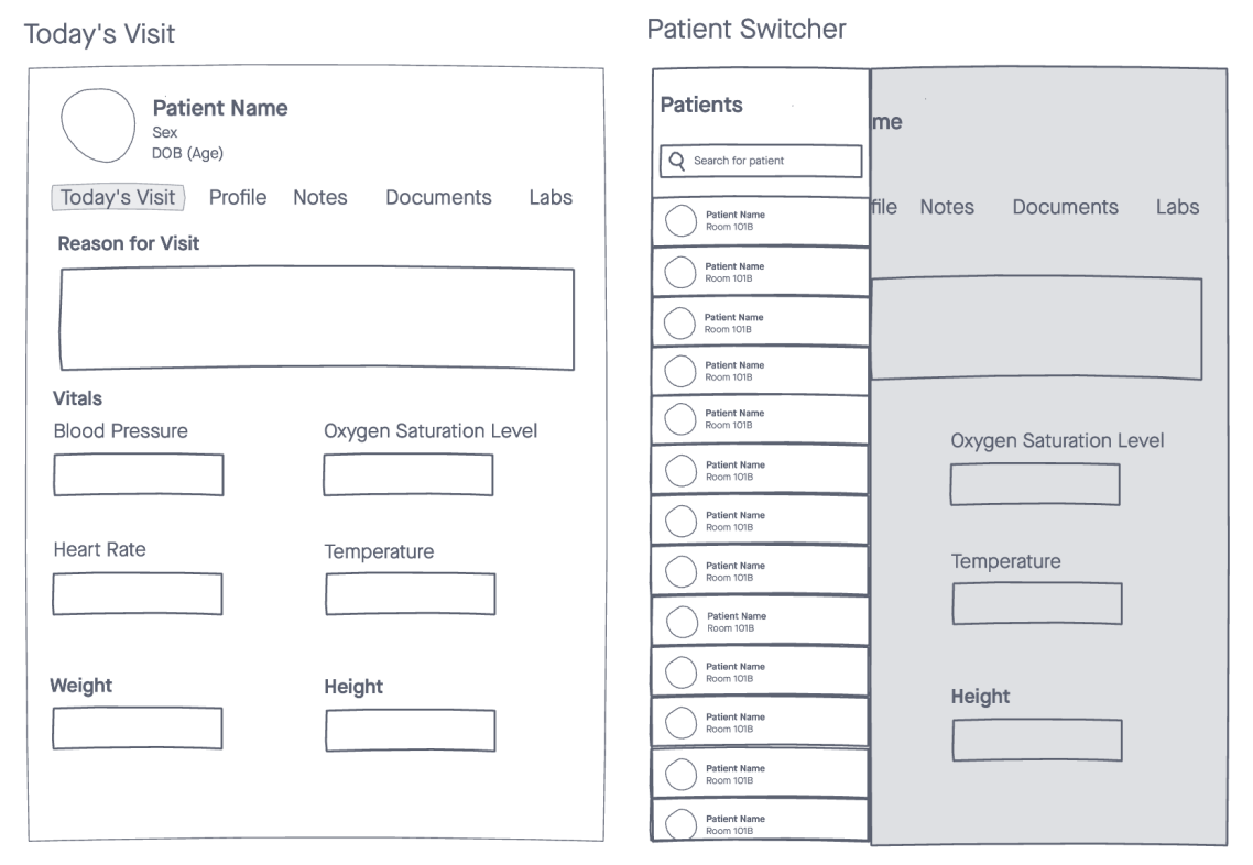
In InVision, Caroline and I sought out to simplify the complexity of current solutions for EMRs in our wireframes. We wanted to emphasize the tools that practitioners needed in the current moment, instead of laying out every tool in the program in a nest of hidden menu, as seen in our emphasis on the current visit, list of upcoming patients, and other context-sensitive features. In InVision, we developed rudimentary ideas for how we imagined multitasking would be in SmartChart through the patient switcher, as well as explored the viability of a multi-user environment through easier logins.
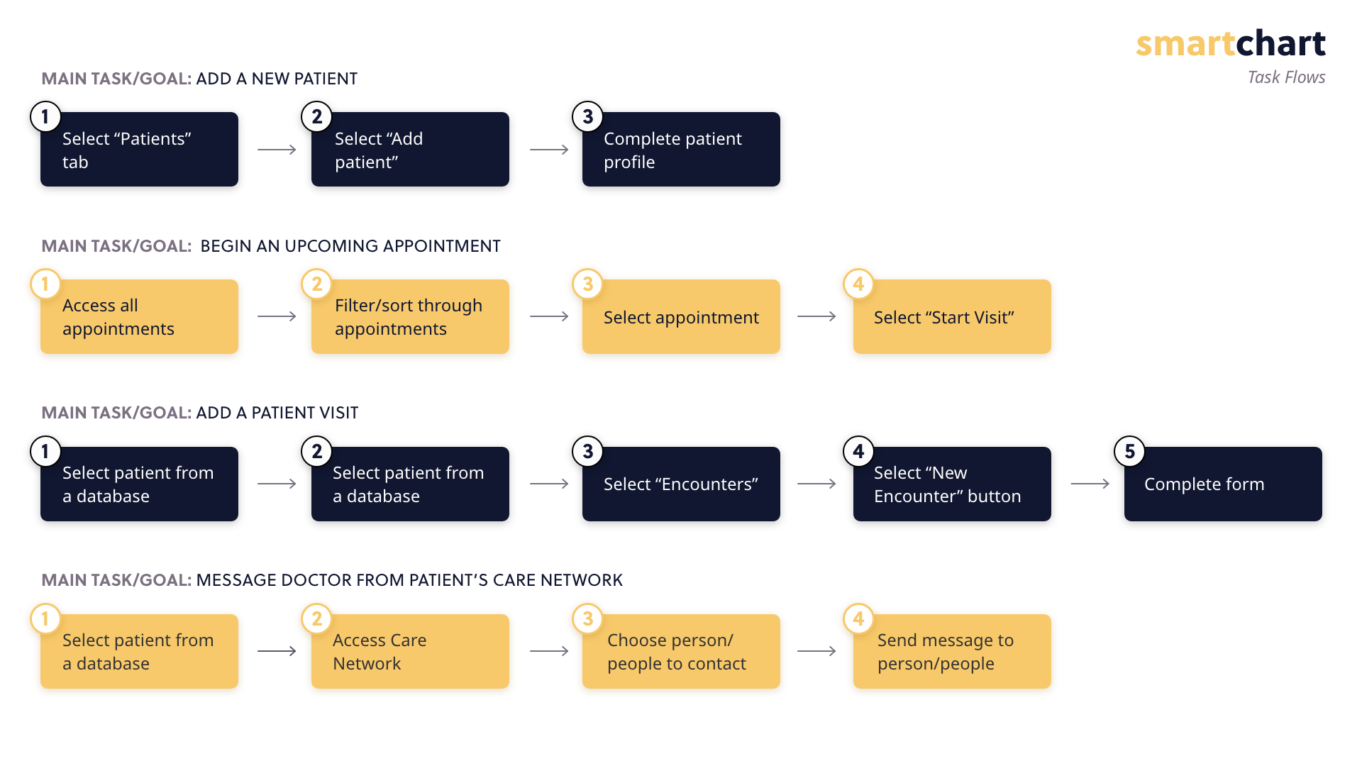
By taking into account the needs and goals of our primary users that we uncovered during the discovery phase, we were able to identify the primary tasks that our users will completing in SmartChart. My project partner Caroline then created these task flows to help visualize the organization of our screens as well as the number of steps it takes to complete essential tasks.
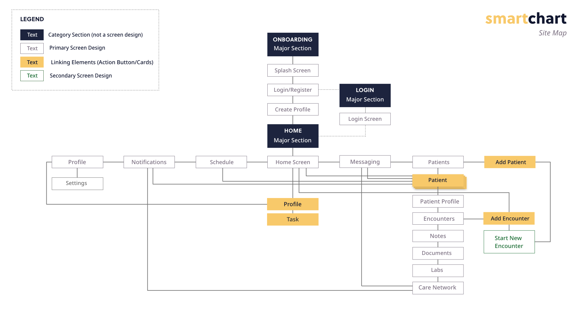
Working hand in hand with the task flows, our team developed a site map that illustrates the relationship and hierarchy between individual screens in the product. Brainstorming the steps required to complete a task allowed us to determine tentative links between screens, tabs, sections, etc. It also allowed us to highlight important calls to action that needed to be implemented later on in our prototypes. Caroline and I determined that the most important aspects of the documentation process is the intake of new information and sharing this information with the rest of the care team. By considering these two main tasks, we designed a workflow that emphasizes easy access to both of these actions, putting these core functions higher up in our site map instead of nesting it within other screens.
Using the hierarchy developed in our site map, we began raising the fidelity on our early wireframes from inVision as well as developing designs for additional product features. Our goal for this iteration was to check the strength of our information architecture (IA) by making sure content is relevant, clear, and properly organized. These also served as the first point of check-in with our professional evaluator required by the LAES Senior Project Specifications.
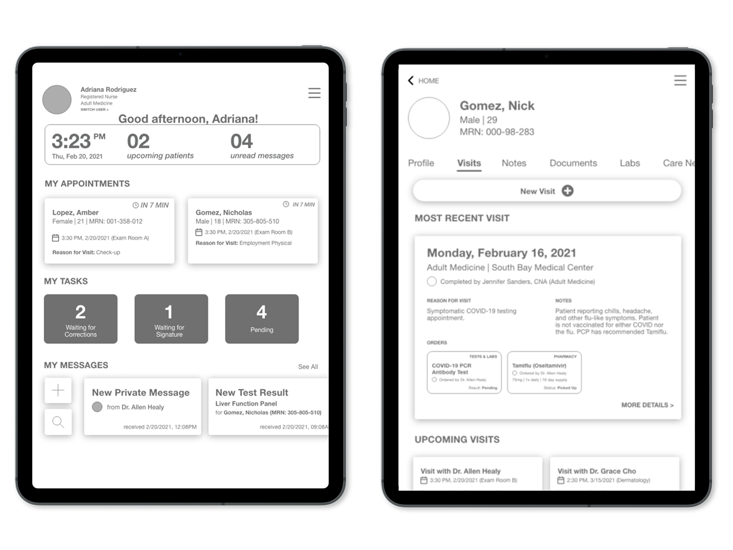
Our preliminary design of the home screen included a greeting banner for the user, an overview of their upcoming appointments, indicators for pending charts, as well as new messages. By using the dashboard model on our home screen, we are able to give clinicians an at-a-glance view of important notifications, to-dos, and upcoming events without overwhelming the already-busy medical professional.
We carried over these usability heuristics of visibility and clean, minimalist design in our Visits page, providing helpful summaries for the most recent visits, applicable notes, and any lab/pharmacy orders made by the physician to provide possible context to the clinician's encounter with the patient.
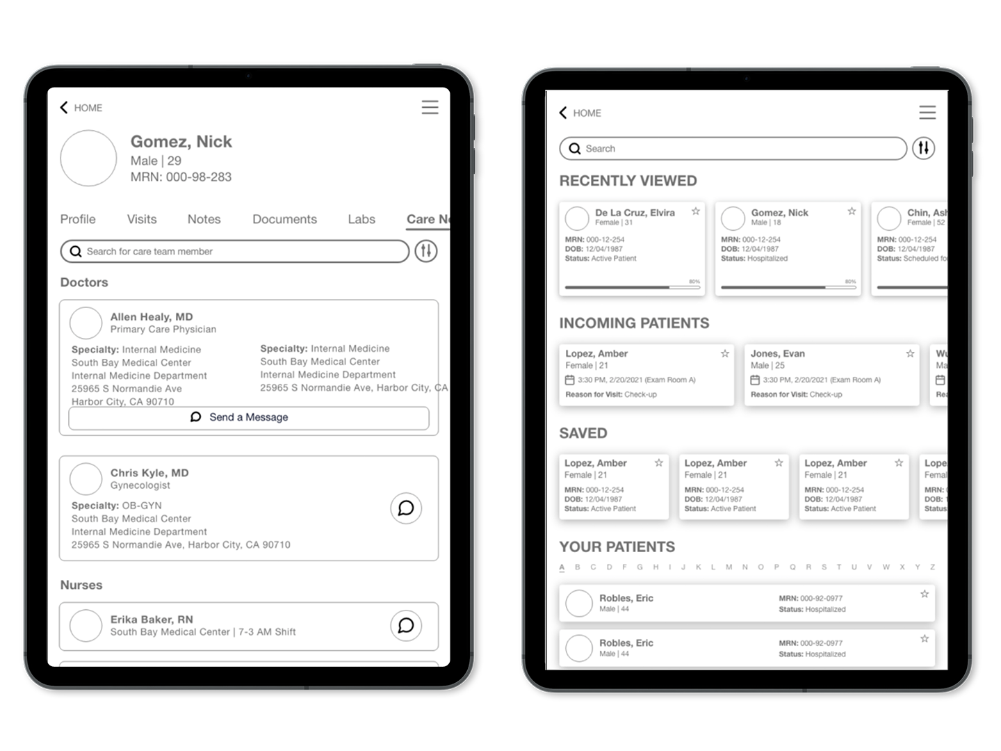
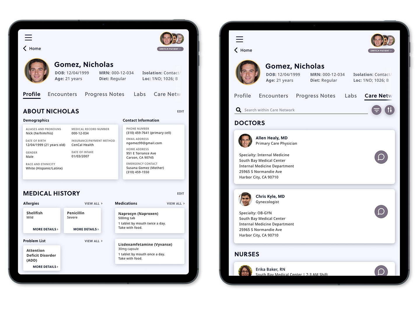
At the heart of SmartChart's vision for a better EMR system is collaboration and interoperability. We know that most people have more than one doctor, having an entire network of doctors, specialists, nurses, and more that facilitate patient care. We wanted to reflect this in our design for the Care Network screen within the Patient profile. By giving information on each member of the care team, as well as easy access to secure HIPAA-compliant messaging between staff, communication and collaboration between many moving parts of the healthcare system is possible and encouraged to keep everybody in the loop.
We chose to adhere to the traditional mental model of a contact list-like structure for the Patients list, while also providing context-sensitive categorization for the list to keep relevant patients within reach for the clinician. Patients who were recently viewed or have an upcoming visit are placed higher up on the list for easy access. Search and sort filters also work to strengthen findability.
With these preliminary designs, we were able to then have a check-in with our professional evaluator to make sure we were on the right track before applying styles and developing additional screens.
Per our project specifications, we were tasked with finding a professional with industry experience to serve as an evaluator of our project and provide valuable feedback to guide the design decisions for SmartChart. We were fortunate to connect with Professor Linh T. Dao of Cal Poly's Art and Design Department. She was our lecturer for ART388: Interaction Design II and a mentor for Caroline when she competed in the Adobe Creative Jam. With Professor Dao's multiple accolades in visual and interaction design, she was a valuable asset in the development of SmartChart.
After developing our medium-fidelity prototypes, Linh recommended that we rethink typographical hierarchy, with it playing a big role in organization especially in data-rich environment such as an EMR system. She also nudged us to be more cognizant of which information is being presented to the user, making sure that it is pertinent and important enough to be featured center stage. Lastly, Professor Dao suggested the idea of increased visibility of patient status, allowing clinicians to discern priority and timeliness between patients. Using this feedback, we were able to be more informed with our direction moving forward with high-fidelity prototypes.
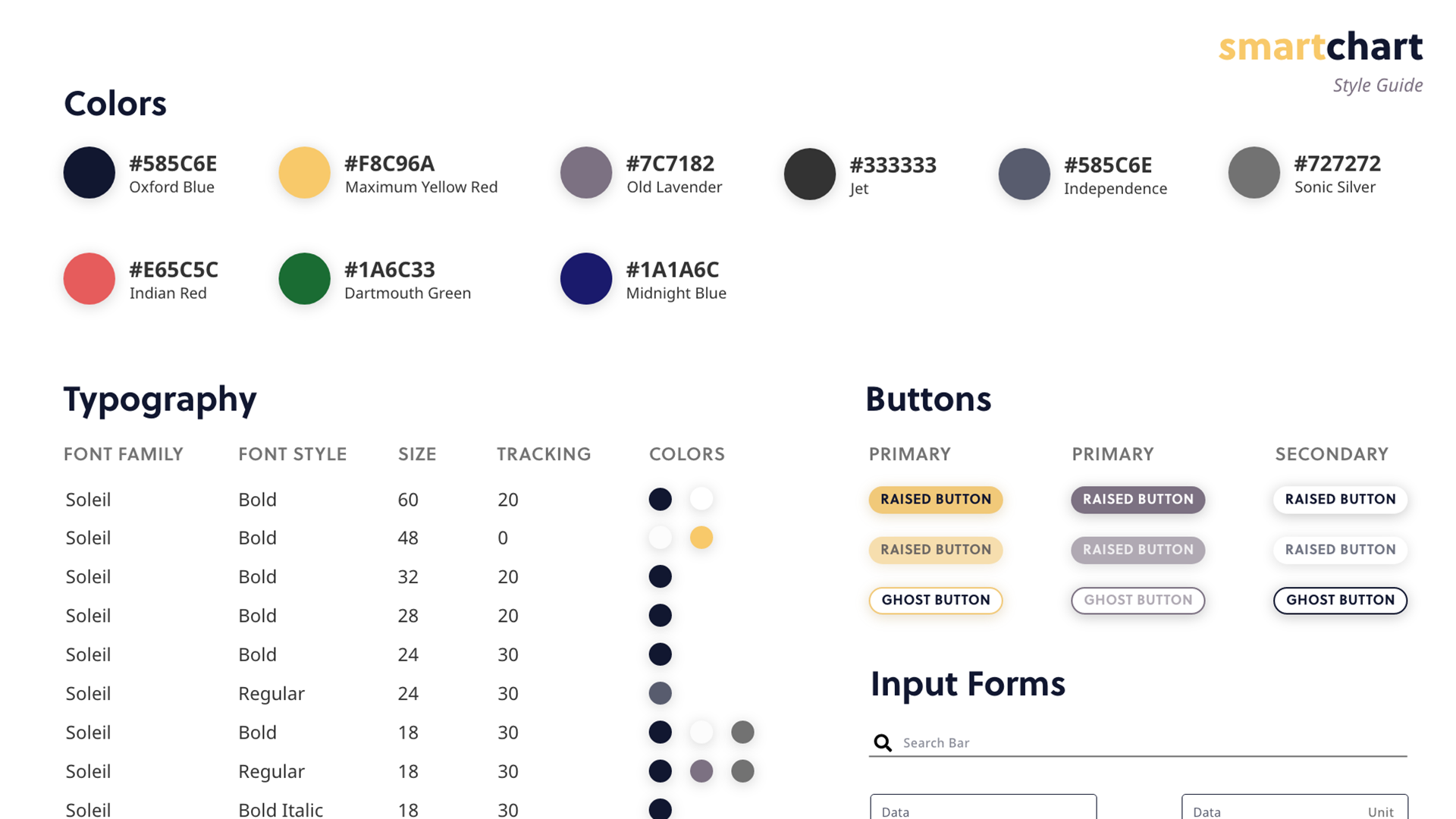
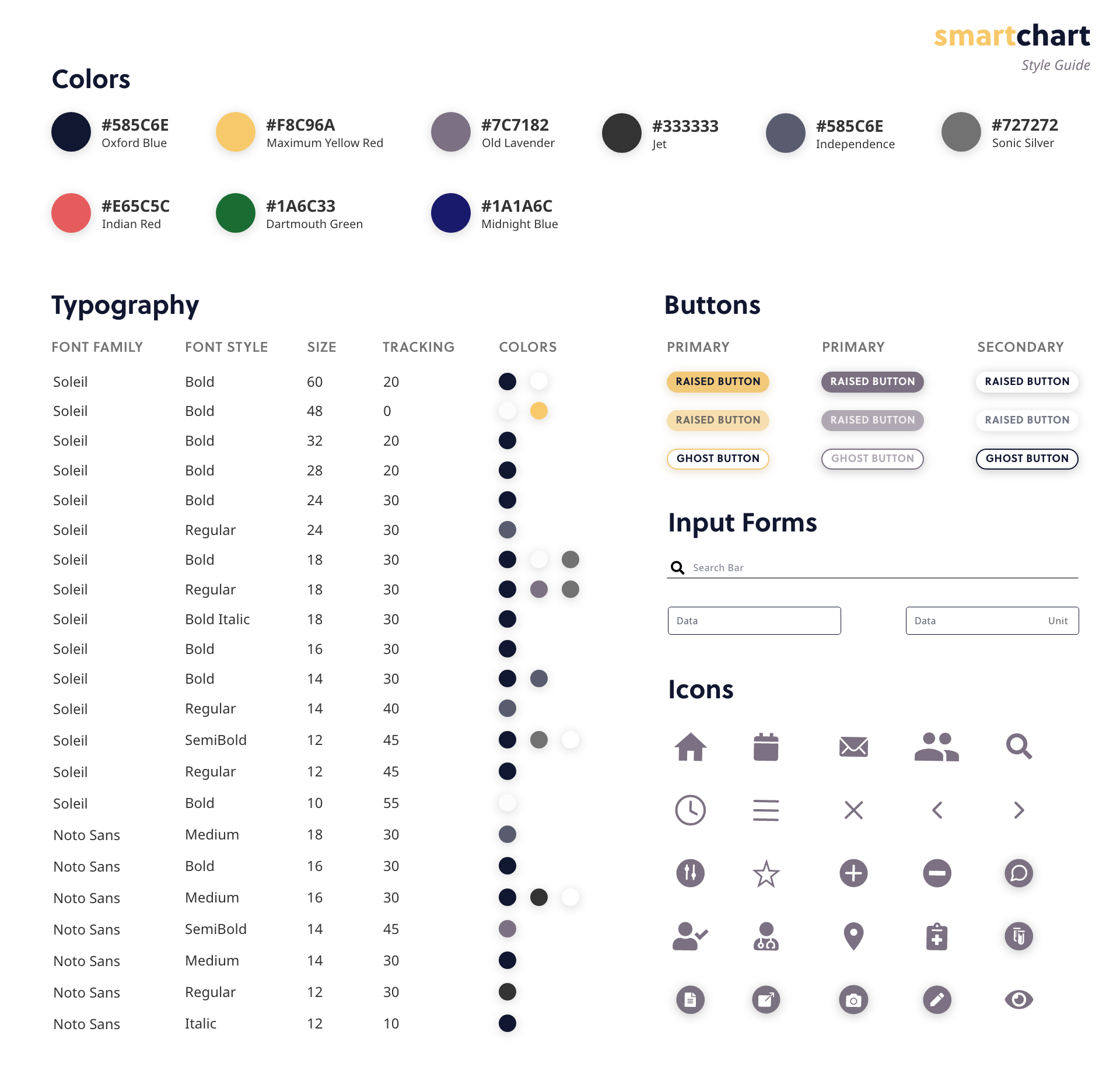
With the comments from our professional evaluator in mind, we began to iterate on our high-fidelity prototype. We chose blue and yellow to be the primary colors of our application and muted tones of gray and purple as secondary colors for the professional, yet unique aesthetic. We kept the interface clean by chunking information using white cards with shadows, so that information would be easily scannable.
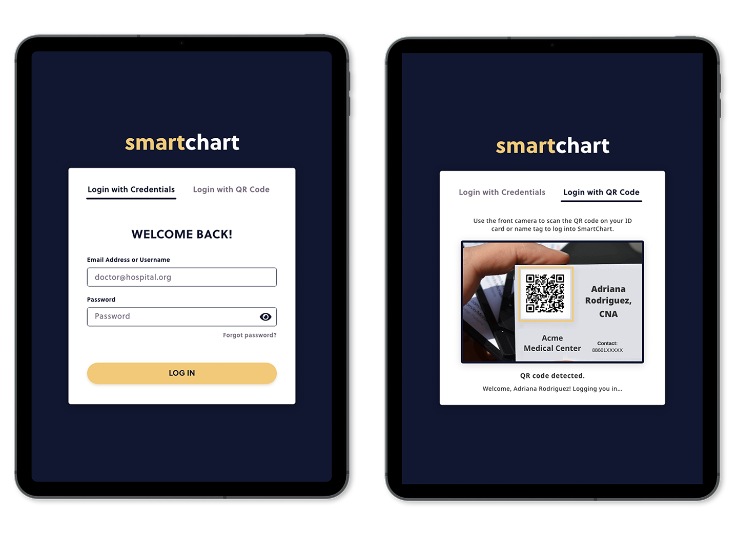
For our Login screen, we gave the user an option between logging in with their credentials and logging in with a QR code to maximize flexibility, ease of use, and the need to remember a password.
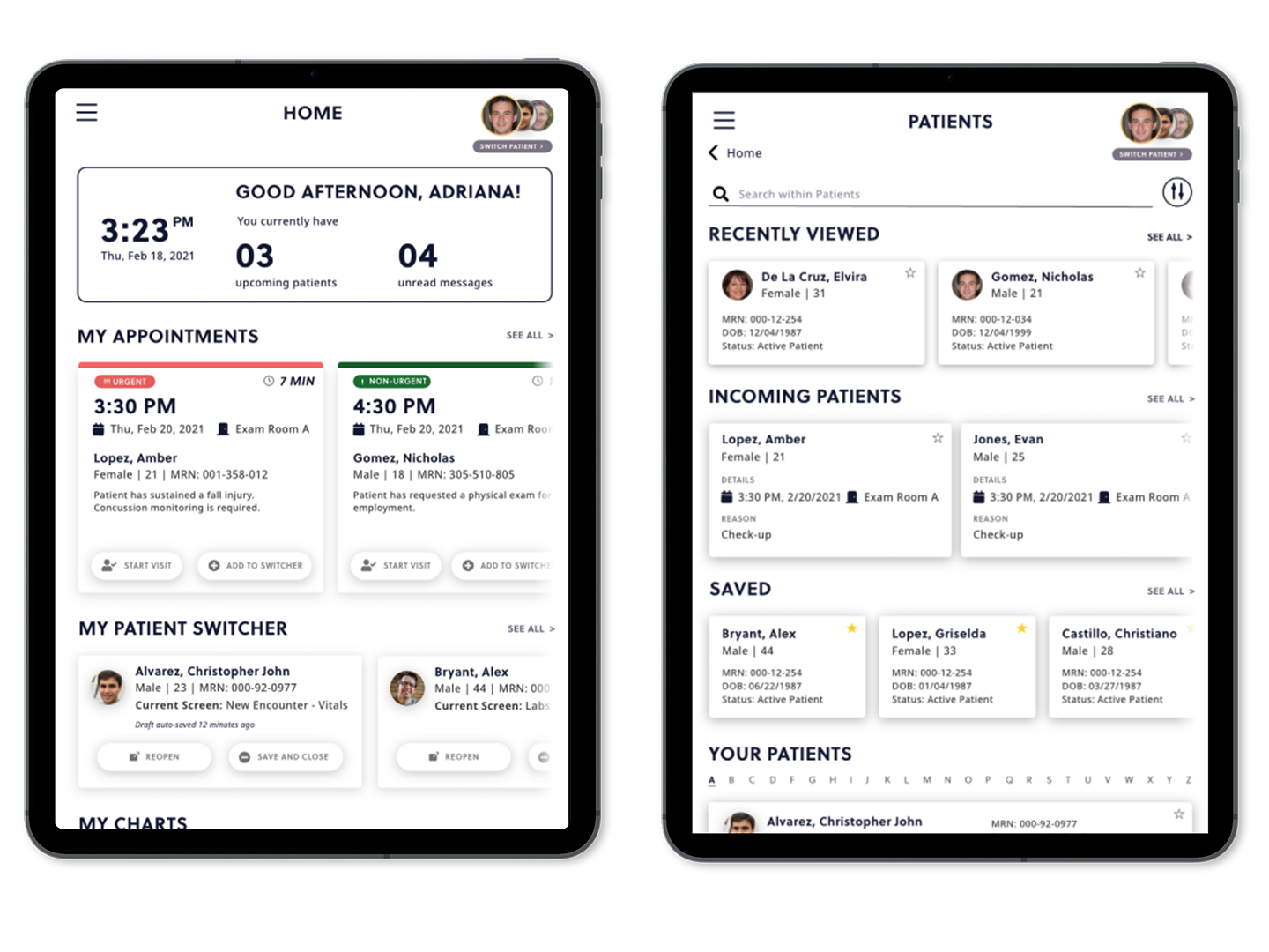
In our Home screen, we redesigned the cards under “My Appointments" to improve the status visibility of each patient. This includes adding an “urgent” or “non-urgent” tag, as well as increasing the hierarchy of the time remaining until the appointment. We also added CTA buttons on each card to maximize efficiency and minimize the number of steps taken to begin the task of starting an appointment. Additionally, we added the “My Patient Switcher” section to the Home screen for easy access. The cards displaying each patient were redesigned in both the Home and Patient screens to include more icons, since icons are easily recognizable and are useful for scanning information.
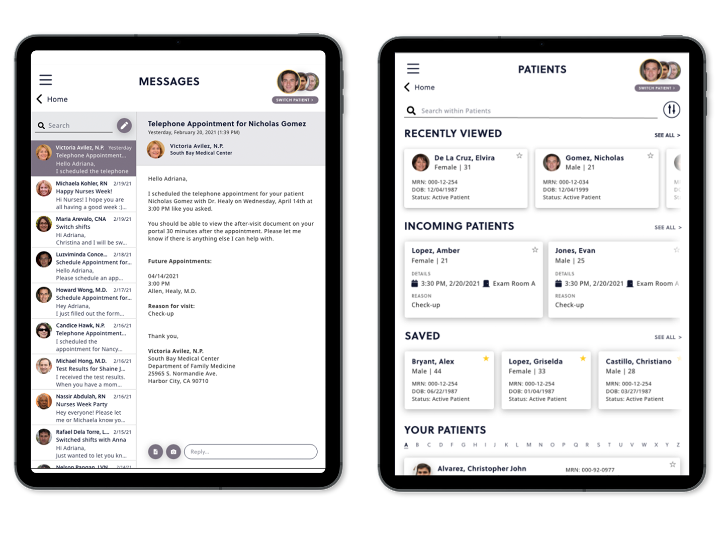
Two other very important features in an EMR system is the ability to communicate and keep organized despite a busy schedule. Through the Messages and Schedule screens, clinicians can securely communicate with their colleagues and see an overview of upcoming appointments in their schedule. For these designs, we drew from our mental model of messages and drew inspiration from applications like Microsoft Outlook and iMessage. In the Schedule screen, we decided to include a calendar along with appointments for the day and a list of who is on-site.
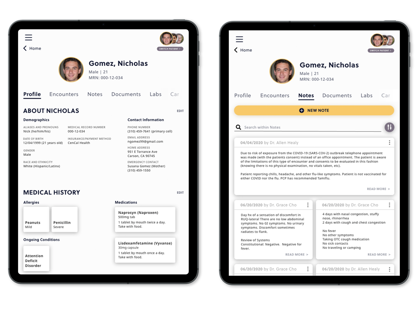
In our Profile screen, we included general information about the patient, such as their demographics, contact information, medical history and social history to give the general overview of the patient that is standard among other EMRs. In the Notes screen, users are able to filter and search through their notes. We chose to make the New Note button larger to emphasize the CTA and increased the size for the most recent note to give hierarchy to the cards. Both of these features work to give the clinician proper context about the visit, giving a clear view of ongoing conditions and past medical history.
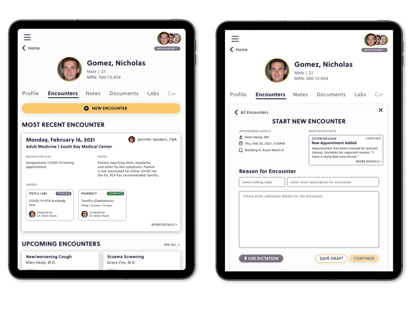
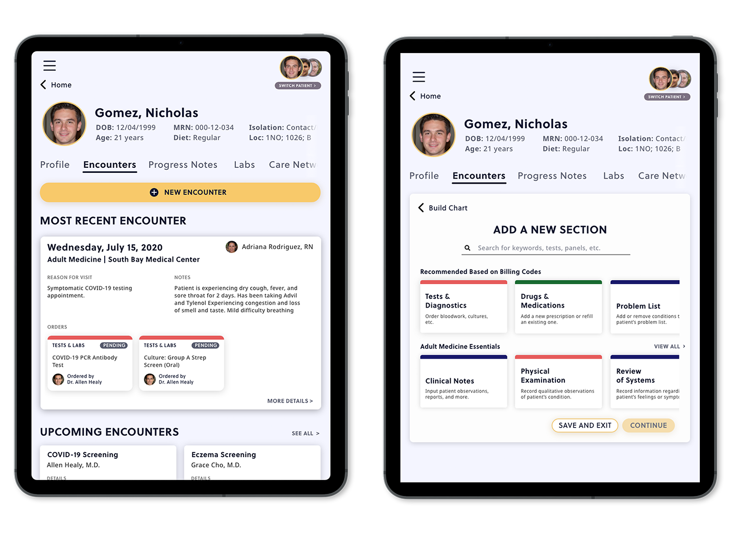
The most extensive work we completed for this prototype was for the Encounters page, since this is one of the main focuses of our project. We included the iconography that was used in the Home screen for the cards for consistency. In addition, we also added tags for orders to increase visibility.
In the Start New Encounter screen, we included information we felt was necessary for healthcare workers, such as the attending physician, time and date, and most recent note for each appointment. We also added a field for the billing code and a short description of the encounter to make the jobs of billers easier by automatically categorizing each visit. In the forms, we included a Use Dictation button to reduce excise and allow for a different method of inputting data. We also added a Save Draft button to allow for flexibility, since users are often interrupted in their work.
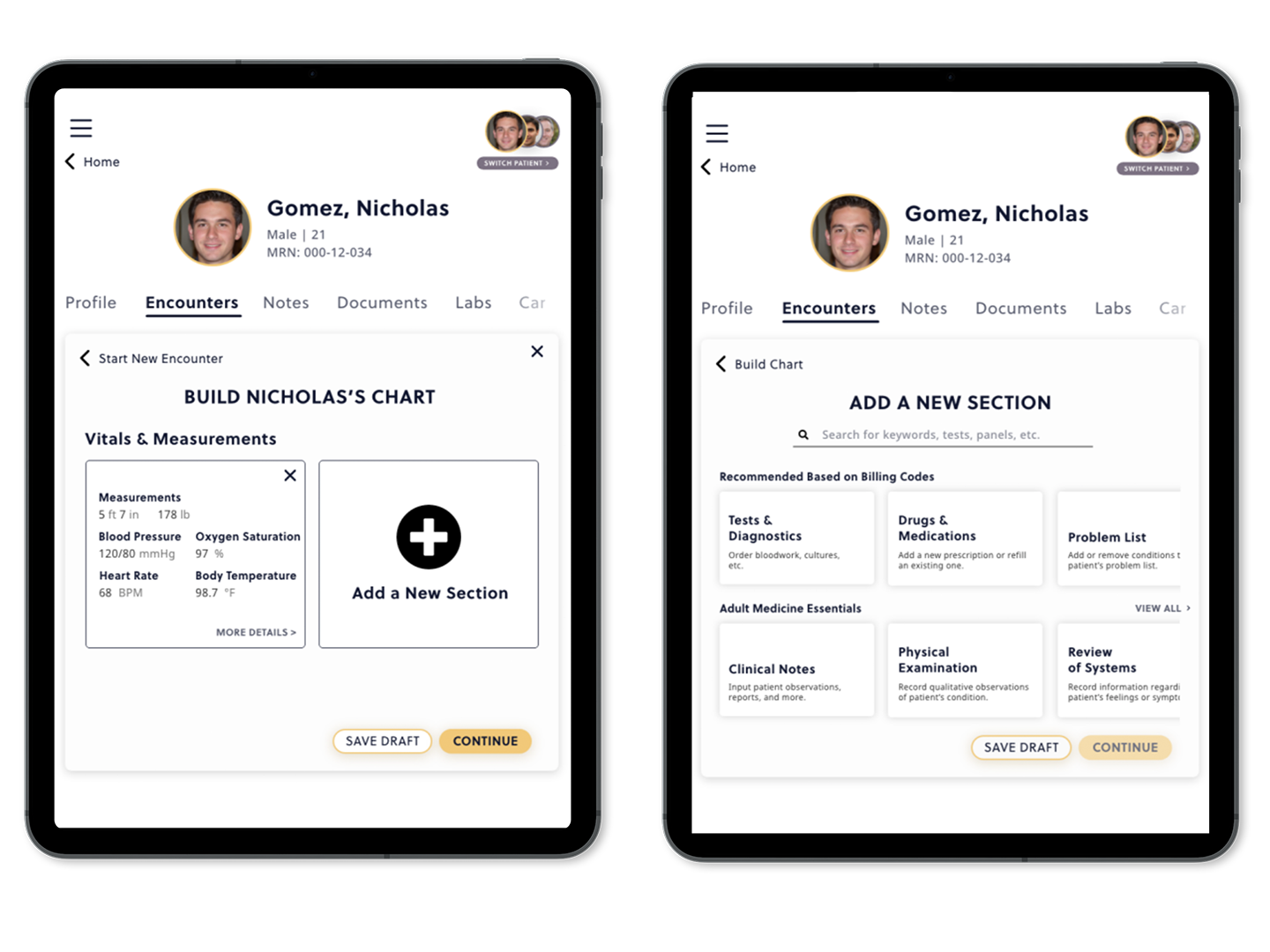
Inspired by preliminary user research lauding the value of templates in their workflows, we took a modular approach to documentation with SmartChart. To accommodate users in different healthcare settings, we broke up the chart into different modules, such as Tests and Diagnostics, Medications, Physical Examination, and more. These modules are intelligently recommended based on billing codes, reported chief complaint, and other variables to reduce cognitive load of choosing applicable modules. This feature is helpful for those who do not need to complete all sections, as they can only choose what is needed.
The modular approach to documentation also cuts down on redundancy and time spent charting, removing the need to document extraneous information. It also provides flexibility by offering simple charts for routine checkups to more robust charting features with the ability to order labs, tests, medications, and more right from the system. With these screens, we were then able to do a round of user testing to validate our solution.
To test our high-fidelity prototype, we conducted five moderated in-person usability tests. Our participants included one Registered Nurse (RN), one Licensed Vocational Nurse (LVN), one Pathology Technician, one Care Ambassador, and one Student Nurse. This is in line with the Nielsen Norman Group's "magic number" recommendation for number of user testing participants. For each participant, we asked that they verbalize any thoughts they had as they were going through their tasks, which were to:
In order to organize the data and understand the feedback we received from user testing, we created an affinity map separating the users' likes and dislikes. Each post-it note represents a comment from a user, and each related comment was placed into a row. We then summarized the feedback for each row to understand exactly which feature or functionality was liked or disliked.
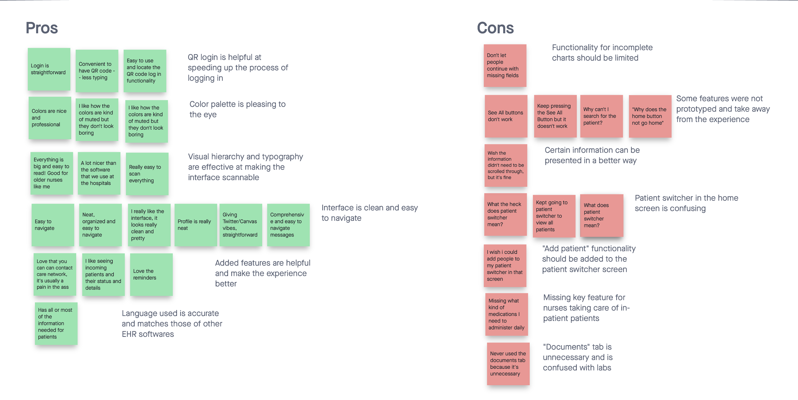
After conducting user testing, we found that users generally liked using SmartChart and found it easier to use than other EMR systems. Visually, users thought that the color scheme, typography, and visual hierarchy made SmartChart easy to scan and read, with testers noting that our implementation was easier to understand and nicer to look at than "software at the hospitals".
In terms of usability, testers praised the clear flows between different screens, as well as clear navigation that could potentially hint at simplified onboarding processes for new clinicians. Features such as the incoming patient view, reminders, and the patient switcher were also perceived well by the panel.
The biggest issue we discovered during user testing was that users did not understand what “My Patient Switcher” was. Many users attempted to use the patient switcher in the Home screen during Task 2 (finding a sample patient), thinking that this would show them a full list of patients since it was presented in the first screen. Despite this issue, many users were able to complete Task 11 (switching patient profiles) using the patient switcher icon on the top bar with no issue. Testers also noted that it would be useful to be able to open new patients from the switcher.
Additionally, the users failed to utilize the “Documents” tab in the patient's profile to complete Task 8 (finding sample test documentation). All five users thought that a blood test would be found under labs, and they were confused about what information would be shown under Documents, as it does not exist in the EHR implementations they use.
Finally, one of our users felt that the information displayed on the patient profile can be presented in a better way that eliminated the need to scroll. Our testing also allowed us to have a better grasp of what information is vital to their daily tasks.
Agreeing with the feedback gained from our user testing, our professional evaluator Linh Dao echoed the same sentiments and recommended taking action to implement the necessary changes to address the aforementioned weaknesses of SmartChart. Despite this, she commended us on the comprehensiveness and scope of our project. She noted that the work we put in accurately reflected industry standards for such a “big project”.
“I think your team has successfully addressed the problem and communicated well during your process,” remarked Dao during our final one-on-one. She further notes that the interface is “attractive”, despite the requirements for such a product to display a great amount of data. She also believes that the experience as a whole is straightforward and intuitive, further highlighting our belief in the success of our solution. Using the feedback from our user testing panel as well as our professional evaluator, we were then able to make informed decisions about changes for our final prototype.
Using feedback gathered during testing, we were able to make key changes to further strengthen SmartChart. The most noticeable change is the increased contrast between content and the background with the addition of a soft light blue in our color palette. This adds visual interest as well as reduces eye strain throughout the software by reducing the amount of pure white in the design. Along with the reworked color scheme were updates to iconography to aid recognition.
View our Final Prototype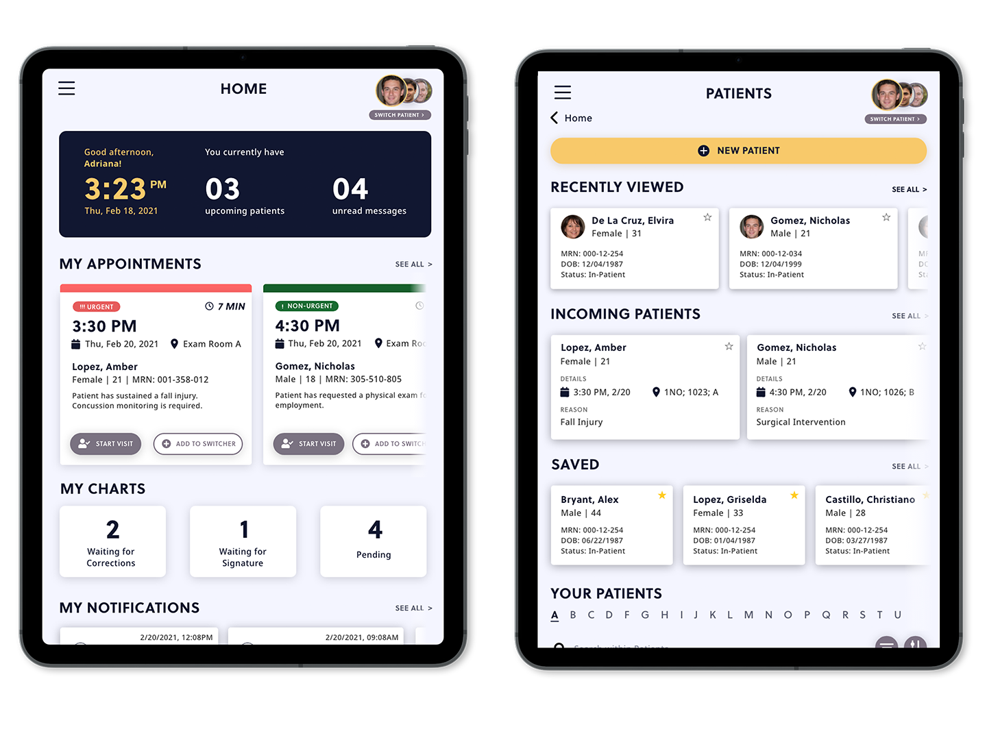
Through user testing, we were also able to discover the confusion around the patient switching system in the home page. With many users thinking that it is the full patient list and not a multitasking feature, we opted to keep the switcher on the upper-right corner instead, where users were more likely to successfully use it.
We also reworked the Patient Profile, introducing a card-based system that carries over the design language established elsewhere in the product. Sections and pertinent information recommended by our user testing group were also added. In addition, the Documents tab has been removed, due to our findings that users never used such a section in other EMR implementations. Sorting and filtering features were also added to increase findability alongside the search function in each tab.
The same design choices were carried over to the Encounter workflow, with updated iconography and colors. Status indicators for pending or completed labs and pharmacy orders have also been added for additional visibility of system status.
By using feedback from our user testing group and our professional evaluator, we were able to elevate SmartChart into a more cohesive, usable product concept. This also allowed us to create a strong design system that can be carried on to other future screen designs, documented in our style guide.
Due to time constraints and the amount of work hours required to complete some goals, there are aspects of SmartChart that would be ideal for further development if or when the opportunity arises. For example, our team looks to further development of SmartChart's multitasking workflows and landscape views—features which required the team to essentially rebuild our prototype from the ground-up. The same reasoning applies for our desire to explore a cross-platform solution to accommodate those who wish to use SmartChart on a desktop or other mobile device.
Furthermore, our team finds it beneficial to consider the development of usability tests between different input methods (e.g. touch, keyboard, handwriting, dictation) and consider their implementation in our product. Due to the feature-set limitations of Adobe XD, however, it is difficult to conduct such tests with our prototype without further development of the product beyond a prototype. Such limitations warrant the possibility of moving forward with full-fledged software development, whether through React (due to its potential for cross-platform web development) or Swift (to support native features such as Apple Pencils, Siri Dictation, etc.).
Lastly, due to the COVID-19 pandemic, we were unable to test our implementation in the field, such as in a medical clinic or hospital. A contextual inquiry in these environments may be beneficial to see how SmartChart performs under the cognitive load of a busy day at work. It is also important to note that additional research remains necessary to check the viability of our product when checked against Medicare guidelines, standard operating procedures, HIPAA compliance, and other industry compliance guidelines.
SmartChart allowed me to take my deepest dive into the UX design process yet, from ideation to handoff. By employing a plethora of industry-standard practices, our team was able to discover the strengths and weaknesses of current EMR implementations in the industry and rethink the way clinicians tackle documentation.
With future investment of time and resources, we are confident that SmartChart can come into fruition as a cutting-edge contender in the EHR/EMR industry. Furthermore, continued development can allow us to meet or exceed the recommendations as put forth by Smelcer et al. (2009) and Rizvi et al. (2017) to create a solution that is flexible, adaptable, and a pleasure to use.
With praise from our testing participants, professional evaluator, and other stakeholders, our team is confident that we are taking the right steps forward in the journey for a better way to chart. By combining the knowledge gained from both an engineering and liberal arts education, our team was able to make strides to solve real-world problems for such essential workers around the world.
I would love to connect with you. Let's build something great together!