In my Interaction Design II course, I was tasked to find a real mobile application in the market that can benefit from research and development of its pain points, strengths, weaknesses, and more.
During the quarter, I was learning Japanese in my spare time. I found it difficult to find an existing solution that helps aspiring learners of the Japanese language learn and practice Hiragana, Katakana, and Kanji – the three writing systems that the language uses today.
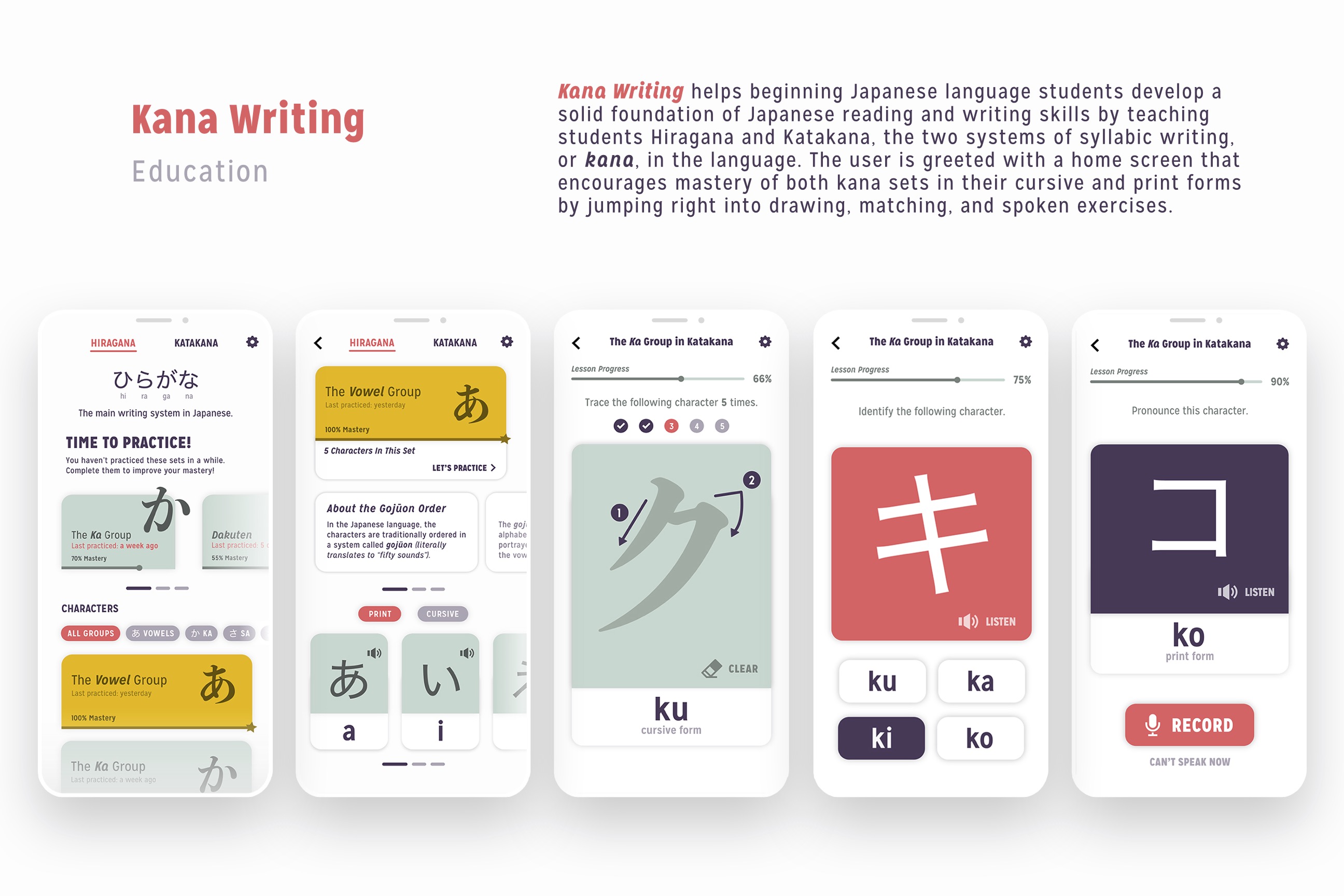
I came across Kana Writing in the App Store. While I loved the functionality that it offered, it had glaring usability and aesthetic issues that hindered its ability to carry out its product vision. Thus, my redesign of Kana Writing came into fruition.
Before moving forward with the redesign, I identified pain points in the system that I aimed to solve with the project.
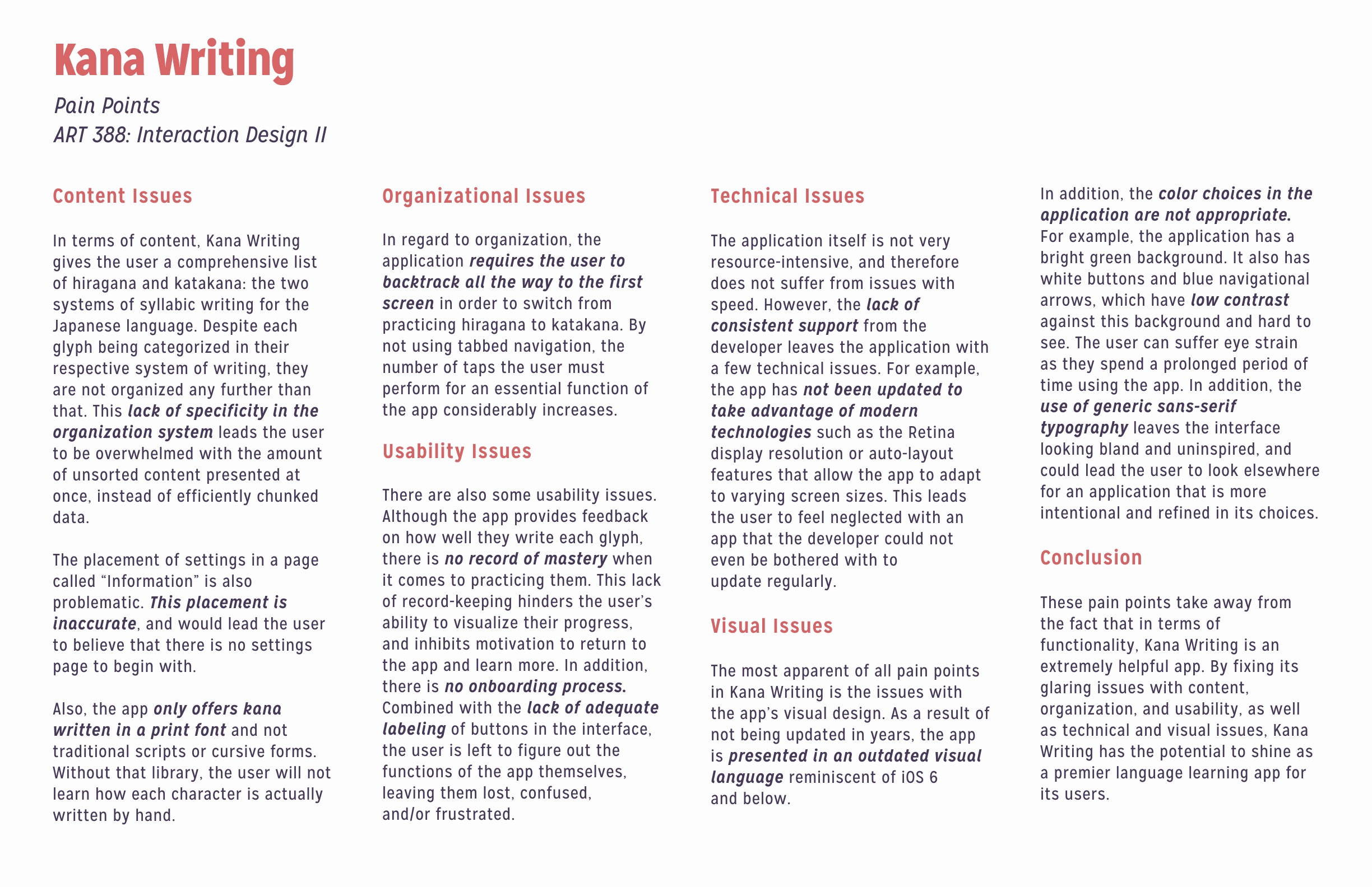
Although the app does a great job of being comprehensive with both writing systems, there is a lack of further organization beyond the two. This lack of specificity can overwhelm the user by presenting all data at once. There are also issues with labeling, such as the settings page called "Information" that can mislead the user.
The lack of a tabbed system in the current implementation requires the user to backtrack all the way to the first screen in order to switch from hiragana to katakana, greatly increasing the number of taps to do so.
The application lacks a proper onboarding process, leaving the user in the dark about the app's functions. Exacebated by a lack of proper labeling of system iconography, it takes a lot of trial and error for the user to learn Kana Writing's functions.
The app has not been updated in years, and therefore has not been updated to take advantage of current mobile technology, such as larger screen sizes and the Retina Display resolution.
The application's visual language has not been updated to adhere to Apple's Human Design Guidelines. Color choices are also inappropriate, with low contrast that can result in eye strain and poor readability.
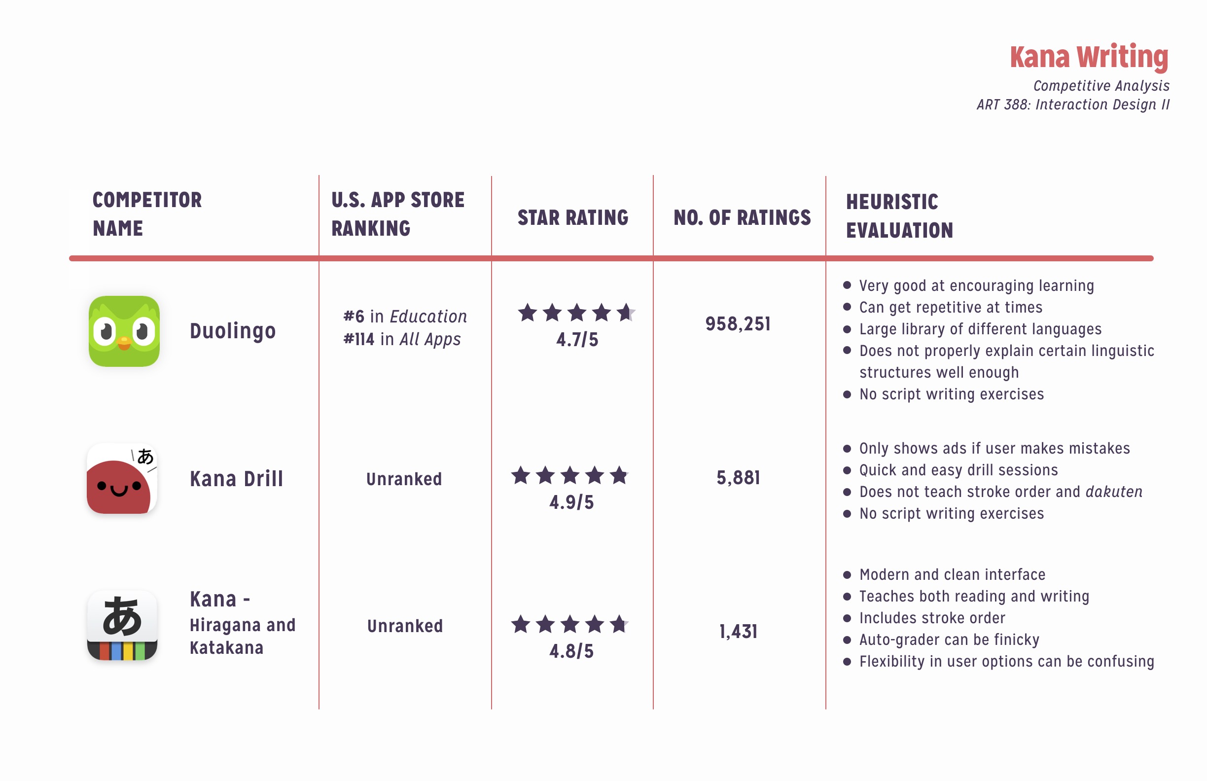
When looking at other solutions in the market to evaluate their strengths and weaknesses, I found three–Duolingo, Kana Drill, and Kana–that stood out as the three most congruent to Kana Writing's current product vision. While existing solutions have clean, easy-to-use interfaces, and methods that motivate and encourage learners to practice, a heuristic evaluation of these products reveal users can find such apps to get repetitive at times. In addition, apps like Duolingo and Kana Drill heavily emphasize listening, speaking, and reading, without teaching how to write characters. Out of these options, Kana is the only one that also teaches how to write characters, but setting up each practice session can be cumbersome and confusing.
With this evaluation, it highlights Kana Writing's opportunity to fill in the gaps that these solutions leave. With a comprehensive library of exercises, as well as incorporating writing lessons and further gamification of language learning, and Kana Writing can set itself apart as the premier method of learning hiragana and katakana.
Keeping these pain points in mind, I developed the following problem statement:
"Aspiring Japanese learners need to learn Japanese characters in a fun, easy-to-use, and engaging environment due to the fact that current solutions are clunky and redundant, while often focus on reading and listening. This leaves students bored, frustrated, and disinterested in forming a habit of learning."
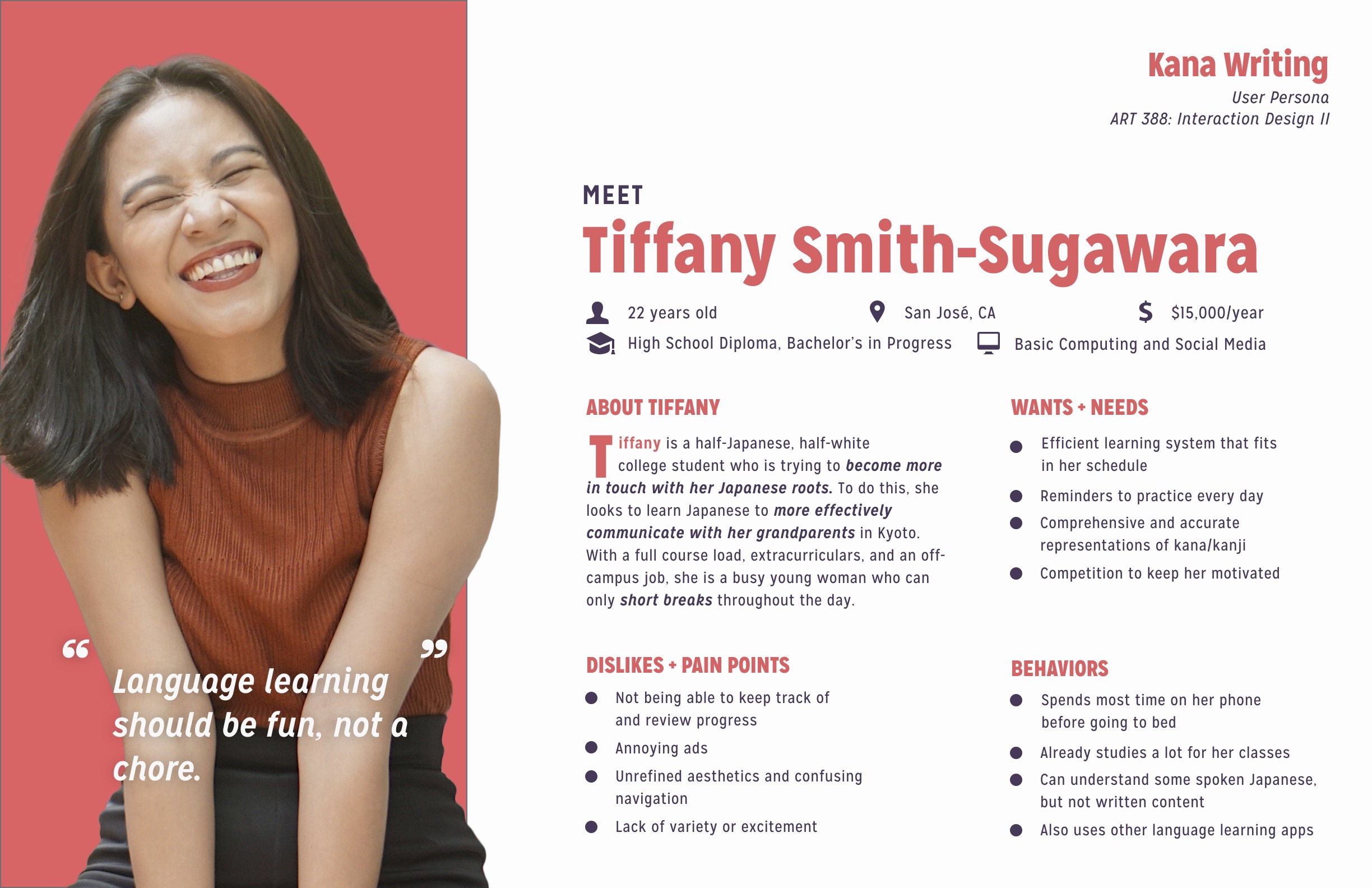
Using the problem statement as a reference, I created a user persona whose goals, expectations, likes, and dislikes set the foundation for the actual redesign of the product.
Our user, Tiffany, is a young woman who wants an effective learning system that motivates her and easily fits into her busy schedule as a full-time student. She wants an accurate, comprehensive guide to learn how to write the language of her ancestors. She does not like monotony, and wants to have fun reconnecting with her heritage, instead of it feeling like a chore.
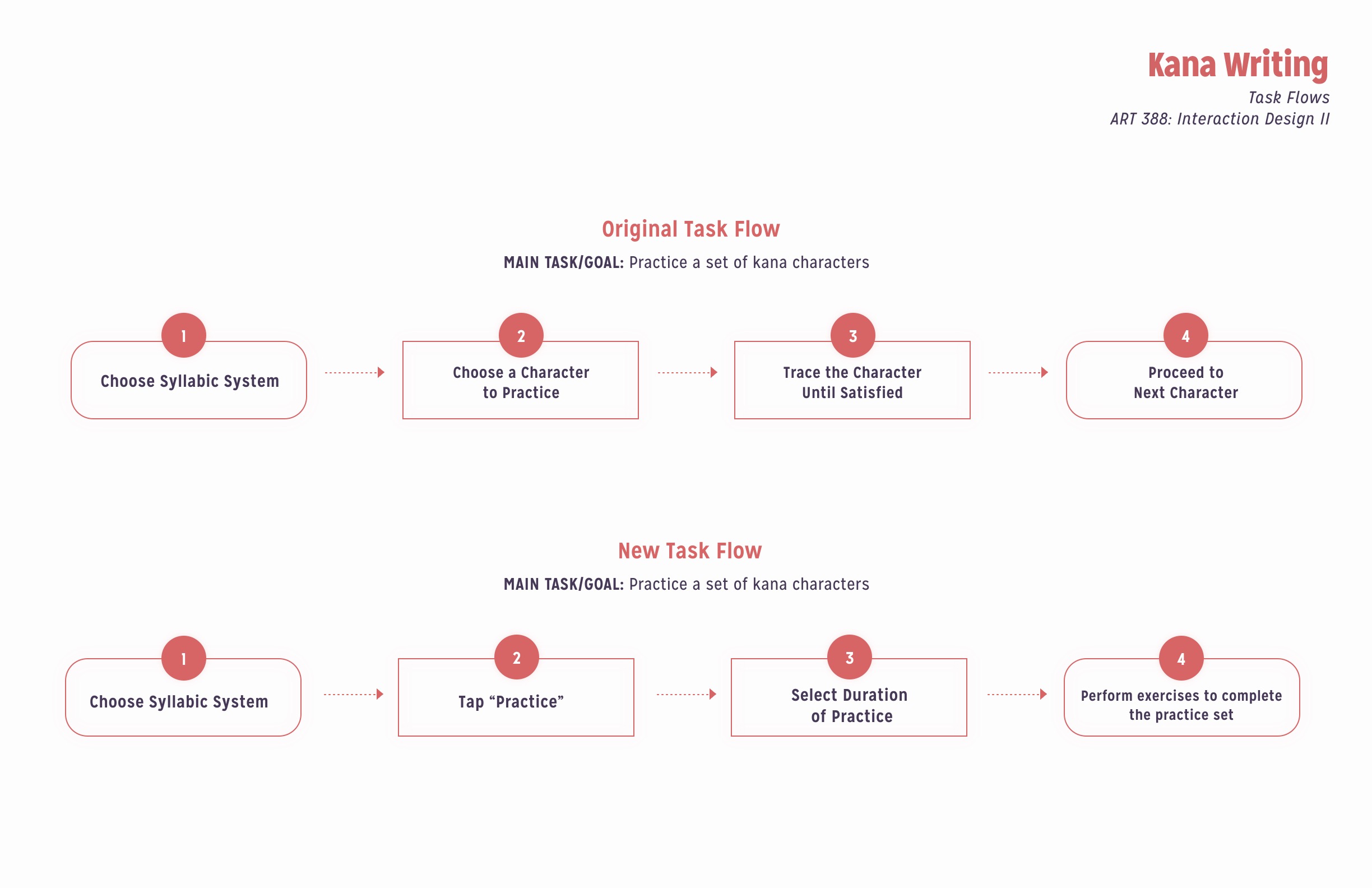
Using task flows, we are able to map out the relationships between the features of our solution. We can use this to gain a perspective from the user in order to see what it takes for them to accomplish their goals. I also wanted to contrast a new, redesigned flow compared to the original workflow. In this case, I wanted to highlight the steps necessary to practice a set of kana characters.
In the new flow, giving the user a choice of how long to practice kana allows the system to quantify progress, so users can see their development as a learner. The old task flow required a lot more initiative from the user, where the learner was expected to simply trace characters until they were satisfied, or more often than not, bored of it. The new flow of generating a practice set for the user also breaks monotony, keeping learners interested and practicing their frequently-missed characters.
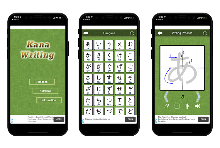
After preliminary sketching and continuous feedback from the instructor, I completed four screen designs that synthesized everything we discovered from heuristic evaluations, our user personas, and task flows.
Although I gained a lot of experience in designing a high-fidelity screen design, a user persona, task flows, and in early research methods, the scope of the project left out skills that I would love to incorporate into this project when possible. Additional screen designs are necessary to create a comprehensive prototype. Style guides, empathy maps, and more are also great ways to add to this project.
In addition, the project would benefit greatly from user testing from the target demographic. Although design reviews are great for receiving constructive criticism from like-minded designers, as well as evaluating the project against the given in-house specifications, we are missing a vital part of the UX design process by not tapping into the wants, needs, and frustrations of real people instead of the prototypical user in the persona. Had the project timeline allowed, comprehensive testing would have put Kana Writing to the true test for success.
This project allowed me to gain valuable insight in how to perform vital UX researching methods before designing a product. I gained experience in refining aesthetics, typography, creating microcopy, and more. It was also a pleasure to see how my interests (in this case, language learning) can meld with my future career goals.
I would love to connect with you. Let's build something great together!